
I've used IM for a long time and mostly for the simple transforms such as resizing jpegs etc but there's a lot more that it can do, including allowing you to build your own tools such as for creating diptyches.
Some of the common tasks that one may perform when preparing images can be summarised as:
- resizing
- montage building
- sharpening
- file format conversion
- colour profile conversion
- adding text
convert and montage although one utility can internally combine some operations of other utilities. All utilities can take a quality option which represents the compression ratio: 100 is no compression which is useful for lossy compressed jpegs.Resizing
Theconvert utility's resize parameter can take several forms such as max pixels or percentageconvert -resize 1024 in.jpg out.jpg
Most parameters will result in the aspect ratio being preserved. The extensive parameters are summarised hereMontage Building
Sometimes we may wish to have a couple of images side-by-side/above-below for comparisons (before/after etc) at the original sizes so we have a concatenation of images. The geometry argument will achieve this.# side by side
montage -geometry +0+0 -tile 2x \
in0.jpg in1.jpg in2.jpg \
out.jpg
# above
montage -geometry +0+0 -tile 1x \
in0.jpg in1.jpg in2.jpg \
out.jpg
The examples above will result in the original images next to each other with no internal padding. The frame parameter can be used to introduce some padding.montage -geometry +0+0 -tile 2x \
in0.jpg in1.jpg in2.jpg \
out.jpg
# above
montage -geometry +0+0 -tile 1x \
in0.jpg in1.jpg in2.jpg \
out.jpg
convert can also 'concatenate' images via -/+append but this will give a sequence of images in a row of column whilst montage will give tiles.Sharpening
This is a quite difficult subject as Photoshop/Gimp/IM seem to have slight differences in the way the express options, all of which may not result in the same output. This article gives into some detail of the options and comparisons.For simple sharpening using the unsharp mask, the IM options are based on radius/sigma/amount/threshold values.
convert -unsharp 2x2+0.5 in.jpg out.jpg
The radius is recommended to be based on the intended output PPI with PPI/150 being a common guideline.S Curve contrast adjustment
This is quick way to apply contrast similar to applying a S-curve. The command takes two parameters: the contrast level to apply (from 1 to 10, typically 3-5) and midpoint to consider brightness increase. The lower the % value, the brighter the final image.convert -sigmoidal-contrast 5,45% in.jpg out.jpg
The radius is recommended to be based on the intended output PPI with PPI/150 being a common guideline.File Format Conversion
Aside from simple jpeg to png to bmp etc and IM determines the intended conversion based on the file extensions. However, more complex conversions are also handled (via the means of delegate programs) such as RAW (Nikon NEF/Canon CR2).IM uses
ufraw (and by inference dcraw) as it's delegate for handling RAW formats - the internal format uses 16bit conversions and dcraw warns about generation of darker than expect images. Some reports of specifying gamma to bring up the brightness of the image. Colour Profile Conversion
For successful colour profile conversions, the input profile needs to known and the input/output ICC profiles are required.convert \
-profile aRGB.icc in.jpg \
-profile sRGB.icc out.jpg
This task is particularly useful if you extract preview images from RAW files.-profile aRGB.icc in.jpg \
-profile sRGB.icc out.jpg
Adding Text to Images
Again, this topic has a vast number of options and possibilities. For simple annotation, we need to know the pointsize of the font and the position.A simple example, putting the text in the top left corner offset 10pixels from the left edge and 5pixels from the top edge:
convert -quality 100 \
-fill white -pointsize 96 \
-annotate +30+25 "some text" \
-gravity northwest
original.jpg updated.jpg
Position of text is given by the -fill white -pointsize 96 \
-annotate +30+25 "some text" \
-gravity northwest
original.jpg updated.jpg
-gravity option and by default, text on the left is left justified, text in the centre is centre justified and text on the right is right justified. Use -font to specify font and use identify -list fonts to see the font names recogonised by IM.Of course this only a drop of the vast functionality provided by IM. Anyone looking to explore more complex usage should start at the list of IM utilities
Rolling your Own Diptych/Triptych
The relatively simple source code uses the IM API to create our multi-composite images/diptyches/triptyches/... The code has been built and tested on Linux x86/x64 as well as WinXP/Vista/Win7.
The prebuilt MinGW Win32 executable (from the above source code) for this tool has jpg/tiff/png read/write support as provided by IM.
This tool differs from IM's own montage as it will automatically scale down the input images so they neatly fit together (scaled to the same min height/weight) in the final image.
Internally, tool works by creating, in memory, a set of individual vertical frames from the images supplied on the command line. When a vertical frame is created from a bunch of images, all these images are scaled to the same width as the smallest image of the particular set.
Following the construction of all the vertical frames, they are then composited into a horizontal frame, where all the vertical frames are scaled to the same minimum height. Spacing/internal borders can be also specified.
The resulting horizontal image will contain correctly proportioned original images.
One note, the tool performs no color corrections so all images are expected to be in the intended/final color space.
The image below shows sample results. On the left we have the 2 sample input images and on the right we have the output: all images are actual sizes - notice the scaled and aligned output images.
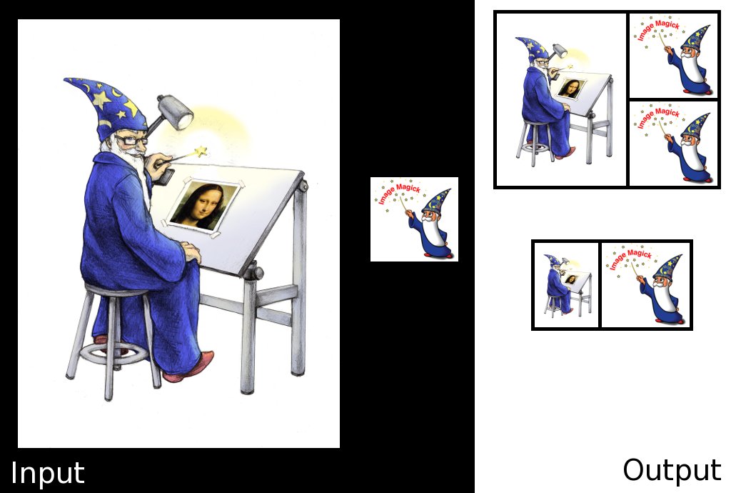
The parameters to create the output image,
ex.jpg, were:diptych -v -o ex.jpg -s 1:2 \
-B 5 -b 10 \
-C black -c black \
wizard.png logo.jpg logo.jpg
diptych -v -o ex.jpg -s 1:1 \
-B 5 -b 10 \
-C black -c black -b 5 \
wizard.png logo.jpg
The -B 5 -b 10 \
-C black -c black \
wizard.png logo.jpg logo.jpg
diptych -v -o ex.jpg -s 1:1 \
-B 5 -b 10 \
-C black -c black -b 5 \
wizard.png logo.jpg
-s parameter specifies the number of images per each vertical frame. Finally a -O option can also be specified to provided the dimensions of the final image and the tool will obey accordingly. Specifying -O 4096 will ensure that the final image is 4096pxls on the longest edge.All command line options are summarised from the
-h flag.And Just Like That..
Now for something a little different, but more in line with this blog.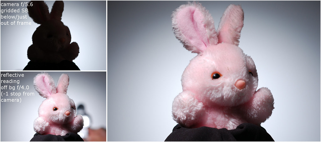
A simple and popular way to provide some background separation to a subject is via a gridded spot. There's a few tricks in getting the gridded spot separation light to look right:
- ensuring center of light is not too hot - I like to meter off the background at 1 stop below key for the gridded spot
- gridded light is not too high - noting that the gradient spreads, we need to ensure that the spot doesn't emanate from right behind the subject (avoid giving it a Jesus halo unless that's the effect). To achieve correct positioning, I tend to place the gridded light at shoulder/below neck height for headshots and for products (like above, just below and out of frame)
- ensure the spot is large enough - a gridded spot that is too small looks odd and I prefer for the gridded light to provide a natural/in camera vignette; distance of the light from the wall and zoom setting on the speedlight will help acheive this but I'm looking for a 1.3-2 stop falloff towards the edge from my metered background reading
No comments:
Post a Comment